-
 Asset Theme Documentation
- Dlisting – Real Estate WordPress Theme
- Fabio Wood Documentation
- Rave Theme Documentation
- Singleland – Product Landing WordPress Theme
- Terra Theme Documentation
- Input
- Muffle – WordPress Documentation
- DDoc Documentation
- Medishop
- Fundly
- Donority
- Carspa
- Niro -WordPress Documentation
- Whal Documention
- Kidzo WordPress Theme
- Sparch WordPress Theme
- Flyn Documentation
- Saasland Documentation
- Denzel Documentation
- Rave Documentation
- Makro Creative WordPress Theme For Saas & Startup
- Coro
- Motodeal Documentation
- Oppi WordPress Theme Documentation
- Filix WordPress Documentation
- Zix WordPress Theme
- Mak WordPress Theme
- Appart WordPress Theme
- Appland WordPress Theme
- Wavee WordPress Theme Documentation
- Home
- Docs
- Saasland Documentation
- Elementor
- Elementor custom CSS classes
Elementor custom CSS classes
Estimated reading : 2 minute
Some style properties can not generate with Elementor controls. As like, box-shadow on button hover, anchor tag hover color, rotate effect, box-shadow on Image Carousel images. For this reason, we applied these style properties with some custom CSS class.
Here, we are listing those custom CSS classes as references. You can also use these custom CSS class with the associated Elementor widgets. Go to the Advanced tab from the widget editor panel, then put the CSS class in the CSS Classes field. See the screenshot below-
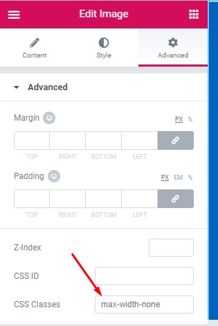
Image Classes
- Use the
max-width-noneclass if you want to disable the Elementor default imagemax-width: 100%tomax-width: none - Use the
image-box-shadowclass to apply a box-shadow around an image or images. You can use this class in Image related widgets (Image, Image Carousel, Gallery). - Use the
rotate_effectclass, if you want to enable rotating on hovering over an image.
Shadow on button hover
- Use the
btn-hover-shadowclass, if you want to apply a red color scheme box-shadow on the button hover. - Use the
yellow-btn-hover-shadowclass, if you want to apply a yellow color scheme box-shadow on the button hover. - Use the
btn-shadow-none-hoverto disable the box-shadow style from a button. - Use the
btn-hover-shadow-black_alpha-1class to apply black alpha 0.1rgba(0, 0, 0, 0.1)color scheme box-shadow on the button hover.
Note: Apply these CSS classes in the Elementor’s default Button widget only.
