-
 Asset Theme Documentation
- Dlisting – Real Estate WordPress Theme
- Fabio Wood Documentation
- Rave Theme Documentation
- Singleland – Product Landing WordPress Theme
- Terra Theme Documentation
- Input
- Muffle – WordPress Documentation
- DDoc Documentation
- Medishop
- Fundly
- Donority
- Carspa
- Niro -WordPress Documentation
- Whal Documention
- Kidzo WordPress Theme
- Sparch WordPress Theme
- Flyn Documentation
- Saasland Documentation
- Denzel Documentation
- Rave Documentation
- Makro Creative WordPress Theme For Saas & Startup
- Coro
- Motodeal Documentation
- Oppi WordPress Theme Documentation
- Filix WordPress Documentation
- Zix WordPress Theme
- Mak WordPress Theme
- Appart WordPress Theme
- Appland WordPress Theme
- Wavee WordPress Theme Documentation
- Home
- Docs
- Saasland Documentation
- Saasland Elements
- Hero Section
Hero Section
Estimated reading : 3 minute
Hero Section is a visually captivating tool that displays contents on your webpages very creatively. Our hero sections are designed with creative design elements to make the webpage visually appealing.
Using Hero Section
The Hero Section comes with the following customization options for Content, Style and Advanced.
Content:
From the content section, you can customize the following elements.
- Hero Content
- Featured Image
- Buttons
Hero Content:
From the Hero Content, you can select from the available presets. You have ensured the presets are unique and different from each other. You can select the presets, HTML tag and subtitle text from this segment.

Feature Image: In this section, you can add the feature image you want to display in the hero ection. You can get creative with the images and ensure it creates a visual appeal.

Second Feature Image: From here you can include additional feature images on the hero section. Make sure it complements the previously added feature image. However, this option is optional and is not present with all the available presets.

Buttons:
By including the button you can get creative with the hero section. This option will allow you to customize the button by using the following functionalities: button title. Button URL, font color, background color, border color, padding, box shadow, typography and more.

Style: From the style section there are many functionalities to work on. The elements of the styling depends on the hero section style you are selecting. We will list down all the available options, but not all are applicable in every style. The options are:
- Style Title
- Style Subtitle
- Shape Images
- Background Image Color
- Background Gradient Color
- Background Right Corner Shape
- Background Gradient Shape One
- Background Gradient Shape Two
- Style Section Background
- Background Overlay

- With style title and style subtitle you can change the color and typography of the title and subtitle.
- With the shape images you can add shapes to your hero section.
- Rest of the functions such as background gradient color, background gradient shapes, style section background and background overlay will allow you to edit the colors of these elements.
Advanced
In the Advanced section of the tool, you will have the flexibility to add margin and padding to the element. You can also modify the Z-index to customize the element more.
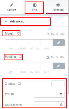
You will also get the chance to edit and customize the following options:
- Motion Effects
- Background
- Border
- Positioning
- Responsive
- Attributes
- Custom CSS
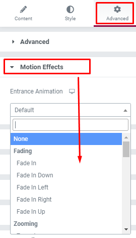
Motion Effects:
From the Motion Effects option you can add different effects such as fading, zooming, bouncing, sliding, rotating, attention seeking motion, lightspeed and more effects to make your website look different.
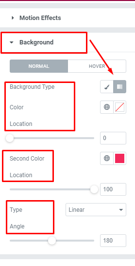
Background:
If you want to customize the background with specific color, gradient or images, you can do that from the advanced settings as well. You can pick background type, color, gradient, gradient type and more.
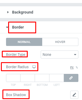
Border:
If you want to add any line, box, dots and other design variations as borders of the element, you can do it from here. You can also customize the size and insert shadow effects if you want to.
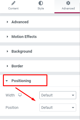
Positioning:
This feature will allow you to fix the positioning of the element. From the width section you can select if the position will be full width, inline or customized. And you can set the position as absolute or fixed as well from these settings.
Responsive:
You can check the responsiveness of the elements if you toggle through the available options. However the change of the widget will be only visible on the live page or preview, not in the Elementor.
